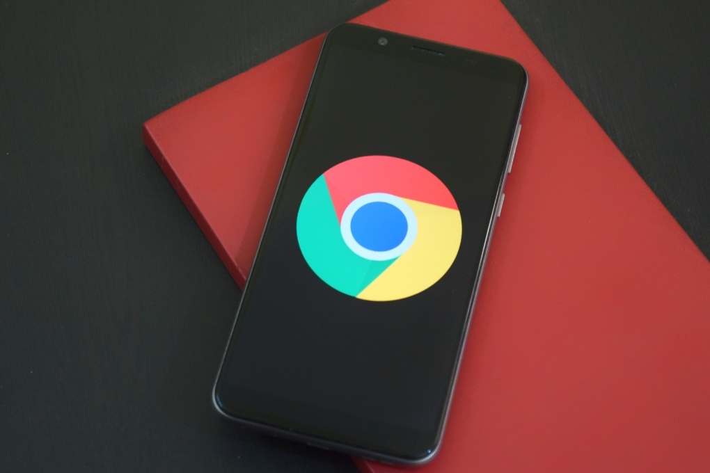
You will hardly notice the change that comes after eight years. The new Chrome logo has appeared in the latest developer reports, which means it will be available to everyone soon. However, it is quite possible that we would not have come to this ” big ” change without warning. Since there aren’t many changes at first glance, let’s take a look at what they’re about.
In addition to being familiar with Chrome, we understand the company’s intention to build on what has been proven for years, and users have become accustomed to it. The new logo may only give most people the impression that it is ” something else “.
So What’s New?
The icon has undergone small visual changes, most visible only in the graphics program. The new version is more straightforward and has gotten rid of the shadows to look flat. On the other hand, the colours are more prosperous, making the icon more prominent.
The changes also occurred in the proportions themselves, which can be noticed in the larger blue circle inside the icon and the shifts of the individual colour fields. It is so clear that the changes mainly concern the details, but that is not the end.
Details In Even More Detail
As a sign that Google thinks about details, a few examples of how icons differ between platforms, the company emphasizes that its icons match the aesthetics of the operating systems in which they are used.
In Windows 11, the design is more graded. In Chrome OS, the colours are more uniform, and in Mac OS, the icon is more 3D-tuned.
Also Read: The Influence Of A Corporate Website On The Company’s Image


